See what matters most with Dynamics 365 Dashboards
Creating views and charts are a meaningful way to analyze and visualize your data, but they often live in multiple entities in Dynamics 365, and truth be told, you probably overlook or do not use them to their fullest potential. Custom dashboards in D365 give you the ability to pull together a variety of views and charts into one place, providing you a single stopping point to easily view metrics which span multiple entities.
Dashboards can be made up of views, charts, web resources and iFrames, allowing you to build your own collection of business intelligence metrics.
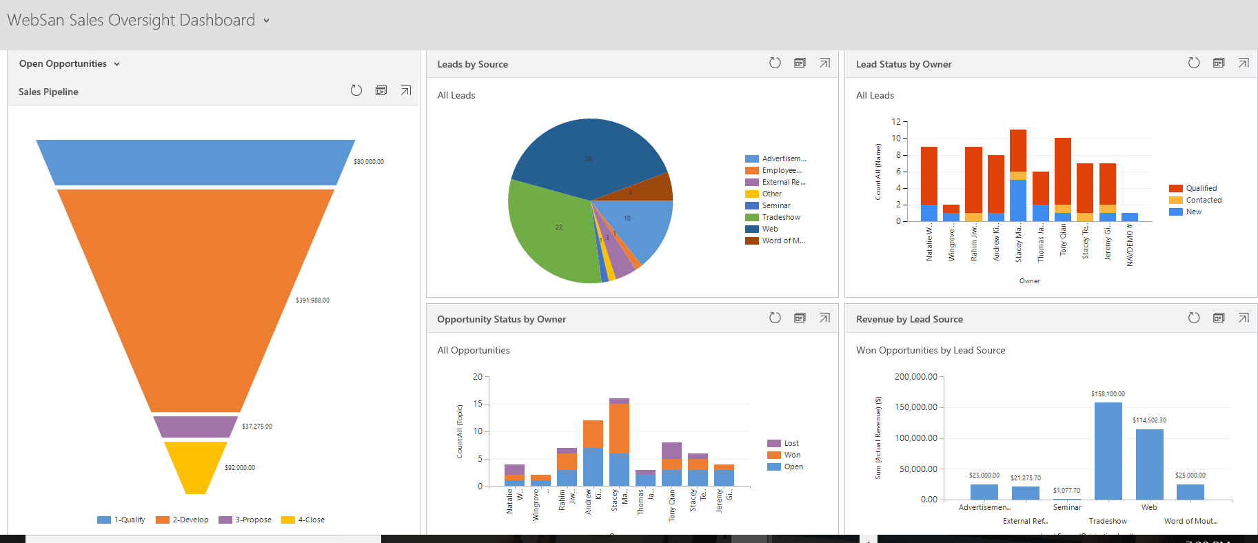
There are two types of Dashboards which can be created, system dashboards and personal dashboards. System Dashboards are created by a System Administrator or System Customizer, and are available to everyone in the organization. Personal Dashboards are those that a User can create for themselves, and are only viewable by that User (or Users they “share” the Dashboard with), and what this blog will focus on.
Creating a Personal Dashboard
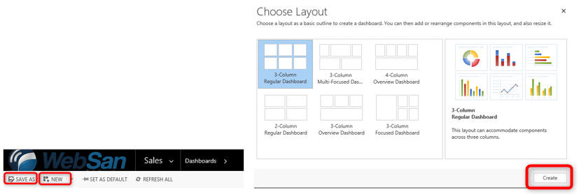
You can create a personal dashboard by going to the dashboard area of Dynamics 365, and selecting an existing Dashboard and performing a “Save As” or create a new one. You are presented with layout choices, select one and click Create.
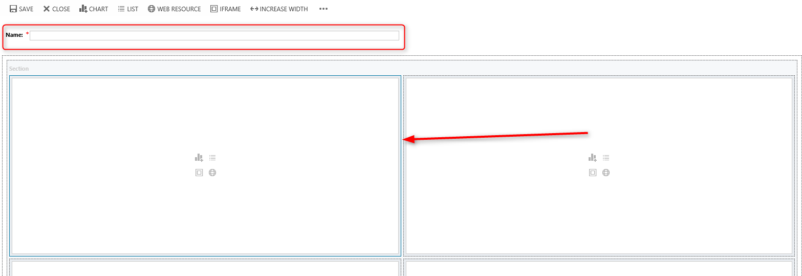
Define a Name for your dashboard and then select any of the components to begin working within it. A blue outline will identify the current component that you are working within.
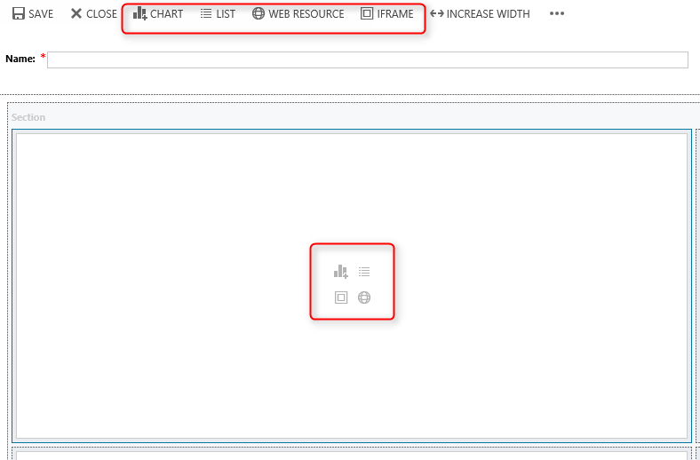
You can either click on one of the icons within the component to choose the type of data to display or you can use the navigation buttons at the top of the screen. When adding a chart, you will configure the view that you wish to have represent your chosen chart.
Once you have chosen the data you want represented, you can rearrange the components and resize them, allowing the display to be visually pleasing to you.
To rearrange the components, click the component header and drag it to an empty area on the dashboard or to the area of an existing component. When you drag a component over other components, a red line appears on top of the components to display where the component will be placed, moving the existing component down.
To change the height or width of a component, select the component, click the appropriate button in the navigation area or click on the ellipses for additional options. The height increases or decreases by three rows. The width increases or decreases by one column.
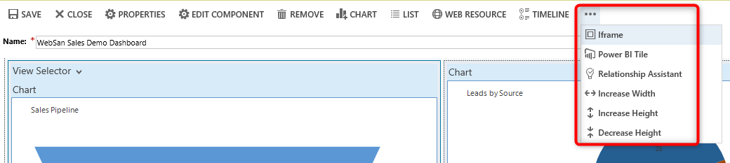
To remove a component, choose it and select Remove.

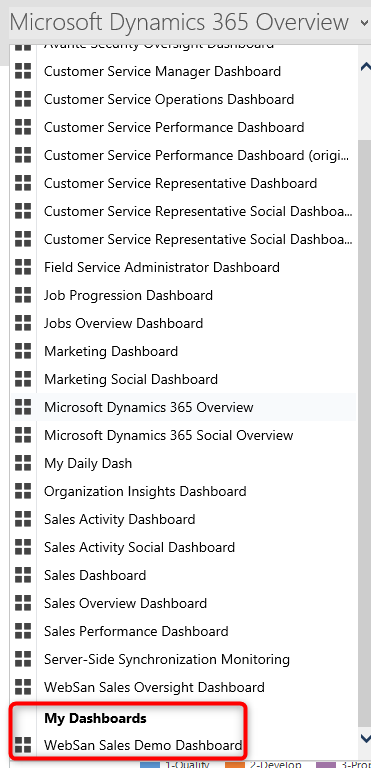
Once you are done configuring your dashboard, select Save and then Close. Your newly created dashboard will now appear in the drop-down of available dashboards.
Now that you have the know-how to create Dashboards, check out your Views and Charts and decide which elements you want to pull together. If you need a hand, we are always available to assist, reach out to us at