Create charts in Dynamics 365 to make your data pop!
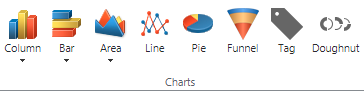
Leave the spreadsheets to your data analysts, and appreciate the effectiveness that charts provide. Dynamics 365 comes with a handful of charts out-of-the-box which you can pair with corresponding views to surface data visually. Like most companies, you likely have unique measures which the standard charts do not account for. That is where the flexibility and ease of creating your own charts in D365 shines. Dynamics 365 provides a variety of chart types allowing you to create column, bar, pie, funnel, and many more chart types, to fulfill your business needs.
Charts interact with the view which is chosen, and the data reflected in the chart is refreshed when you toggle between views. So, if viewing My Opportunities, the chart will depict that information, if you switch the view to All Opportunities, the Chart will change to reflect the data of the newly selected View. Similarly, you can switch Charts to display the View data in another way.
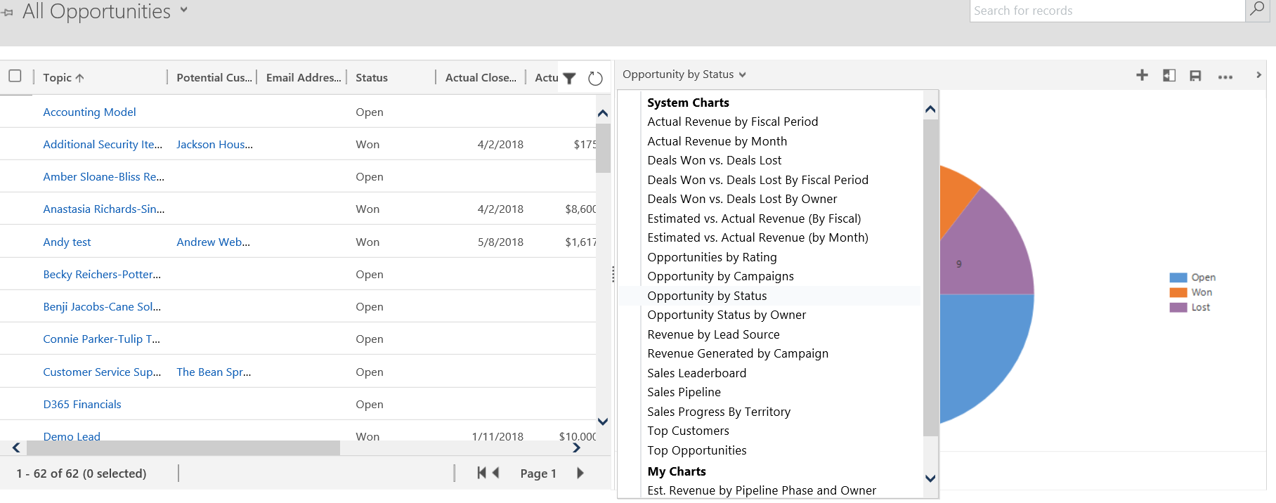
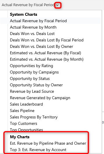
There are two types of Charts which can be created, system charts and personal charts. System Charts are created by a System Administrator or System Customizer, and are available to everyone in the organization. Personal Charts are those that a User can create for themselves, and are only viewable by that User (or Users they “share” the chart with), and what this blog will focus on.
Creating a Personal Chart
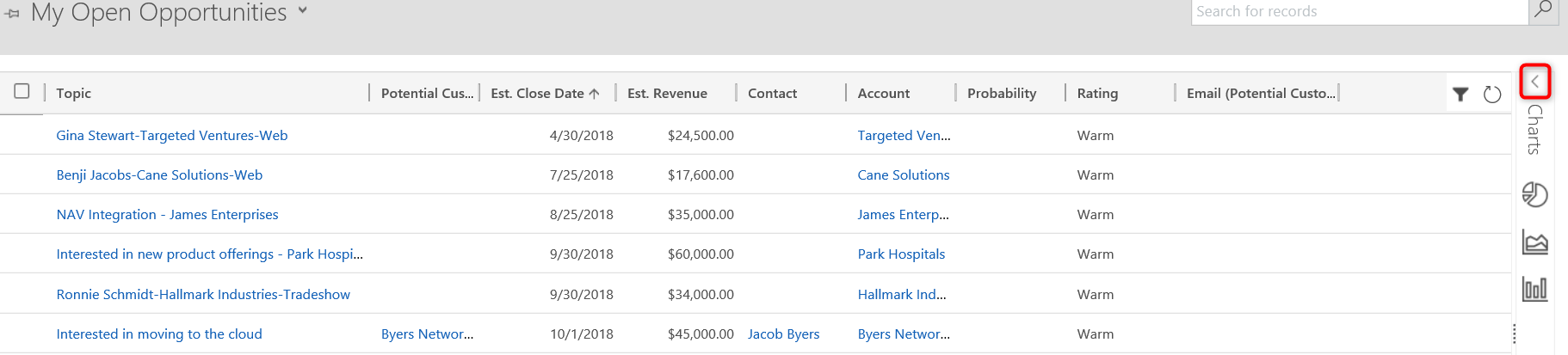
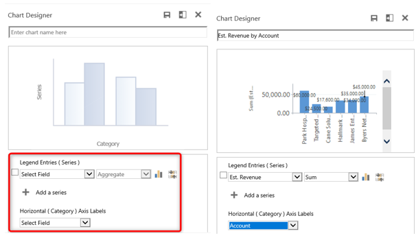
To create a chart, navigate to the entity (Accounts, Contacts, Leads, Opportunities…) for which you want to create a chart and choose the view which best demonstrates the data you want to visualize. Click the charts pane to expand this section.
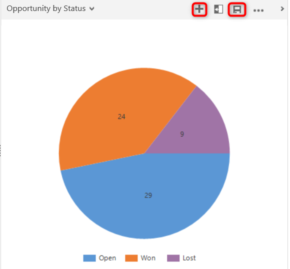
You can either create a chart based on an existing one by clicking on the disk and performing a “Save As” or you can create a new one by clicking the plus symbol.
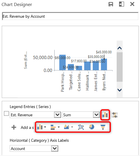
Specify what you want to display in the chart. Indicate the field and aggregate option for which you want displayed for the Series axis. Then select a field for your Category axis. You can create a chart with either multiple series or multiple categories, but not multiples of both.
Click on the chart icon to select the type of chart you want to create.
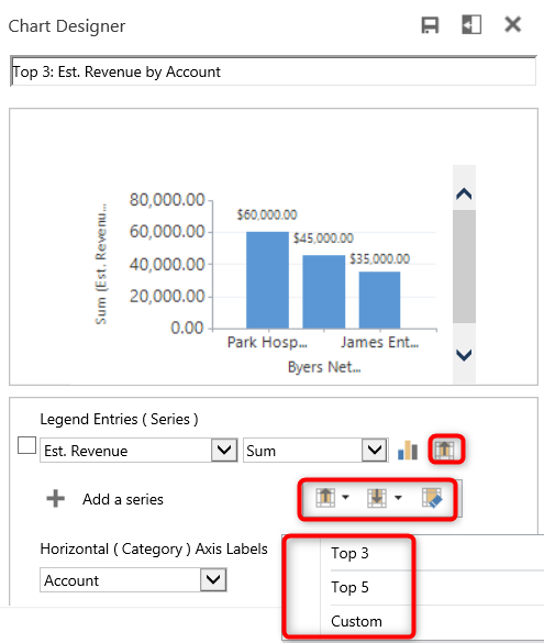
If you want to apply any specific filters, you can utilize Top and Bottom Rules. This allows you to only show the top or bottom values for your query. For example, display the top 3 Accounts by Estimated Revenue.
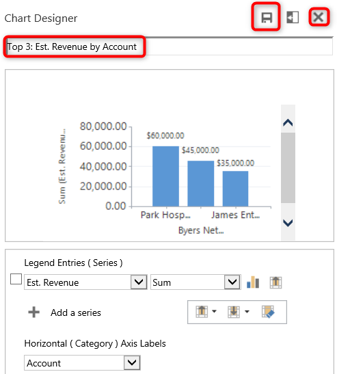
The chart is automatically named based on the fields you chose for the series, category axes, and top/bottom filter, but you can re-name the chart to a value of your choosing. Save when done. Click the “x” to return to the chart selector.
Your personal chart(s) will be displayed at the bottom of the chart selector.
You now have the basic steps to create your own personal charts. Start thinking about your data, and how you may be able to add a visual twist. Should you need a hand, we are always available to assist, reach out to us at